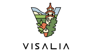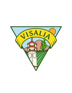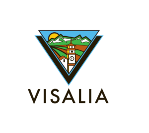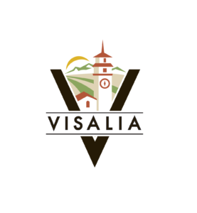
The City of Visalia Logo Redesign Committee met Wednesday, July 10, at the Visalia Convention Center to discuss possible modifications to the final five designs and recommend compensation to the winning artist.
By the July 2 deadline 87 submissions had been received by city staff.
The Logo Committee chose their five finalist Monday, July 8 and on Wednesday reconfirmed their decision and suggested modifications to be forwarded to the artists. Suggestions included changes to the font, adding lines to give an impression of agriculture or adding hands to the clock on the Fox theater.

Besides their suggested modifications, the committee wanted to communicate to the city council the challenges of picking a final five.
“None of us felt passionate about any particular one,” said one member. “I’m sitting here trying to tweak something I don’t love.”
One committee member did feel that submission number 7 stood out. “I absolutely loved it,” they said.

At the Monday, July 15 Visalia City Council meeting city staff will make a short presentation and launch a webpage where the community can give their feedback. The city is looking for constructive comments, possible modification suggestions, and why or why not the commenter likes a particular logo.
The staff are requesting that the community submit their feedback by July 26. Public comment can be received through the website, mailed or handed delivered.
Finally, the public feedback gleaned from the website, committee suggested modifications, along with the five final logos will be compiled into a staff report and presented to the city council August 5. The city council is expected to choose a logo that evening or may decide to wait until the artist can make possible modifications.

During public comment before the Logo Committee meeting started, April Lancaster said that according to social media the “community still feels ignored and that they do not matter.”
Efrain Becerra said the committee needs to try and avoid getting the same reaction from the public as happened with the first logo. He said if a logo gets selected without public feedback “people are still going to be angry.”
Becerra said that the most popular logo according to the social media he was following was number 35 with the yellow banner. He said the community feedback he read wants an element of old Visalia in the logo.
While the committee saw value in feedback from social media they also acknowledged its toxicity. One of the committee members said that they had to privatize their Instagram account because of negative comments after their name was published.

For this reason the Valley Voice has decided not to reference the committee members by name in this article.
In terms of compensation one committee member felt like it wasn’t their place to decide how much to pay the winner.
“The person writing the check should decide” meaning the city council said the committee member.
Another committee member suggested a minimum of $1500 and the rest of them agreed. The one member who felt the city council should decide recused themselves. It was also agreed that if the winner wants to come forward they would also receive some sort of recognition such as a plaque. As of now all submission have been anonymous.
When the city’s webpage for public comment goes live next Monday the link will be posted on Valley Voice’s facebook or the city’s facebook page.

Why change it?
The new logos like plain.
Who’s dumb idea was it to change it?
I Like the old logo better than any of the others. It’s ridiculous to change it. Such a waste of tax payer dollars. It’s very frustrating with the economy like it is today, why would we even consider changing it? Our government local or national doesn’t listen to their voters.
Absolutely NOT!! Why change it??? The new ones are so boring and depressing looking. Please just leave it!!! If it’s not broken why fix it?😭
Why must everything change? Sometimes things are perfect the way they are. The city logo is beautiful and familiar and has been used for 25 years… there’s history there. Wouldn’t it be better to keep something associated with Visalia that all the citizen’s love rather than insisting on a change? Must everything be updated because someone got a whim to do it? Just like tearing down old homes or buildings, you can’t replace something that has history. If it isn’t easily reproduçed on a tshirt, get a simple logo that simply says Visalia for tshirts. Don’t throw away the beautiful logo that the citizen’s love! Keep it and let it be known for future generations as the official logo of Visalia.
I like 56 or 35 the best. These seem to be the ones that capture the Central Valley the best and your eye the most.
Leave it alone.
Truly what was wrong with the logo we had.
Im sure we have many areas we could use that money to better our community . Come on visalia do better
I like #7. I like that the Valley Oak is represented, and the nod to Ag. .
Use the old one. You had perfection, don’t change it.
Keep the old one! Best representation of Visalia.
Money could also go to some good cause!
Keep the old!! It is still number one over all these entries!
#7 if I have to pick one, but frankly I don’t like any of them.